AnaCap.
Client
AnaCap
Agency
Kota
My Role
Art Direction
Branding
Website UI & UX
About
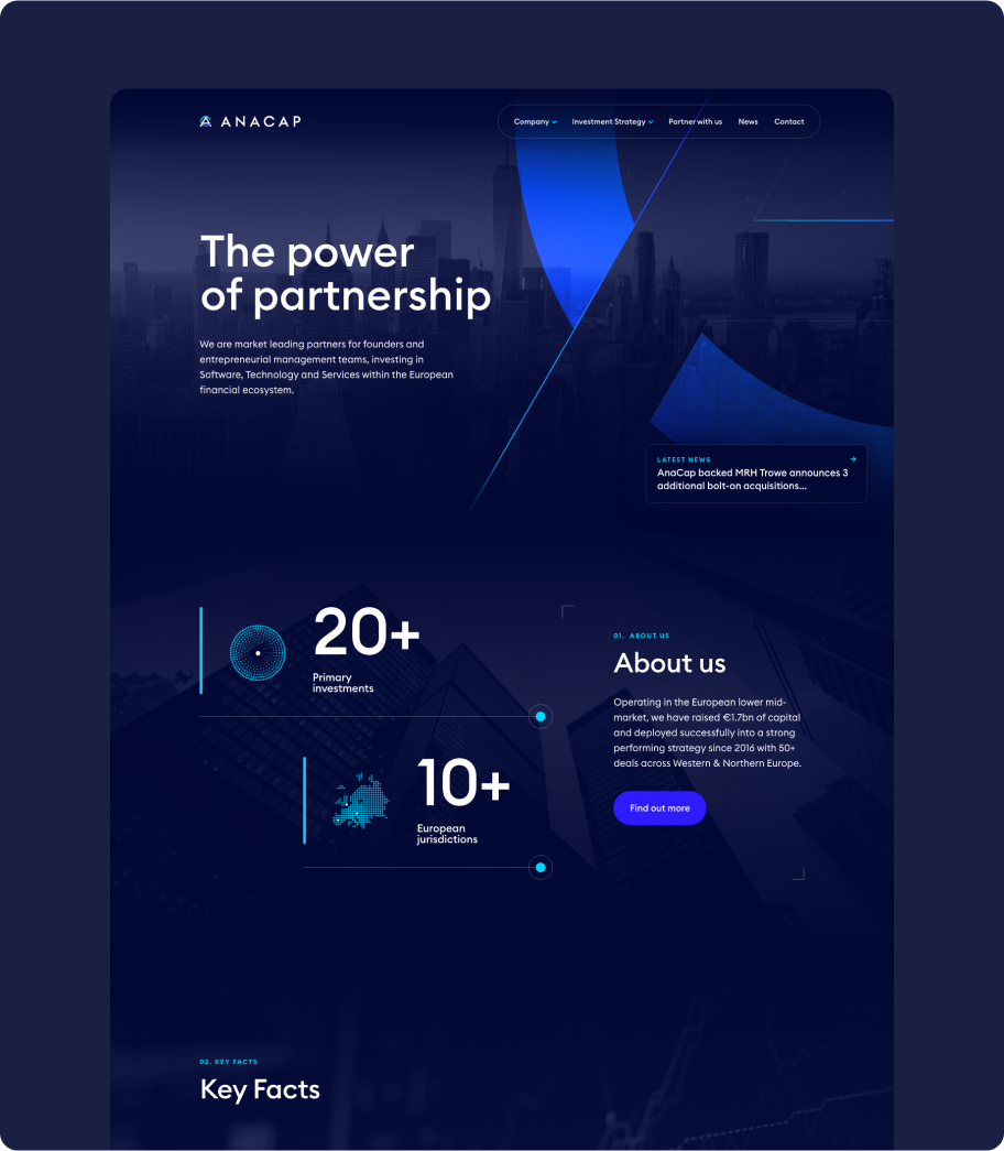
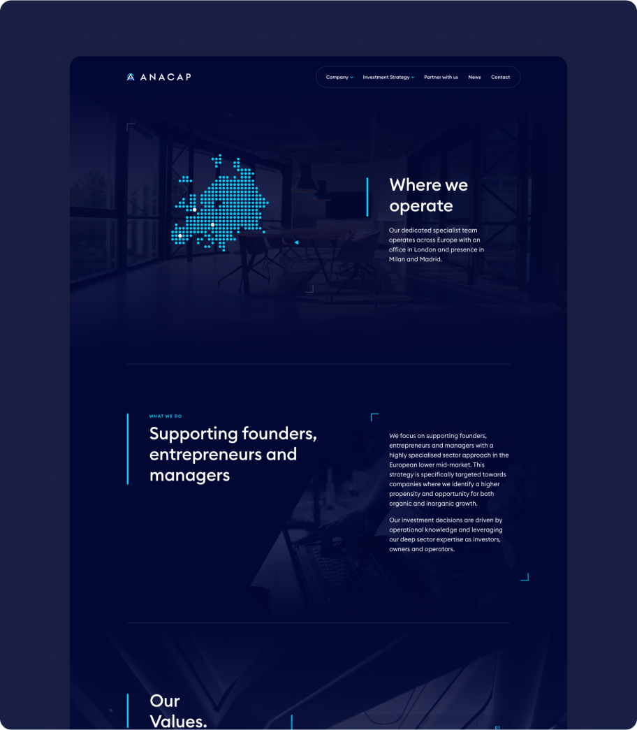
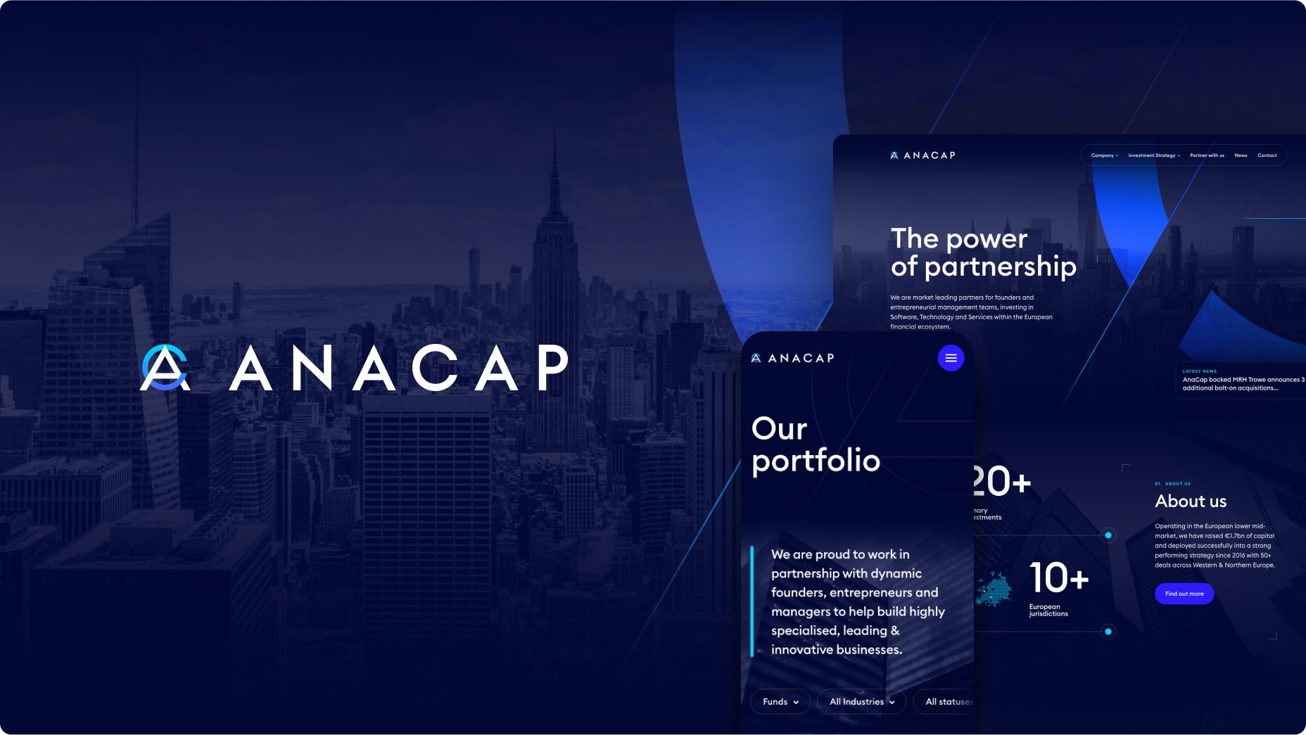
AnaCap, a prominent investor in the European financial sector, collaborated with Kota to revamp their company's image and develop a new website. My role involved delivering a comprehensive rebranding solution, covering the logo, website, business cards, and presentations.
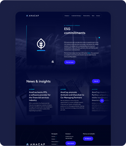
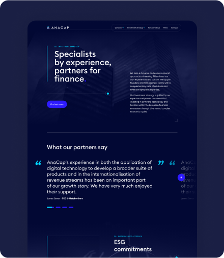
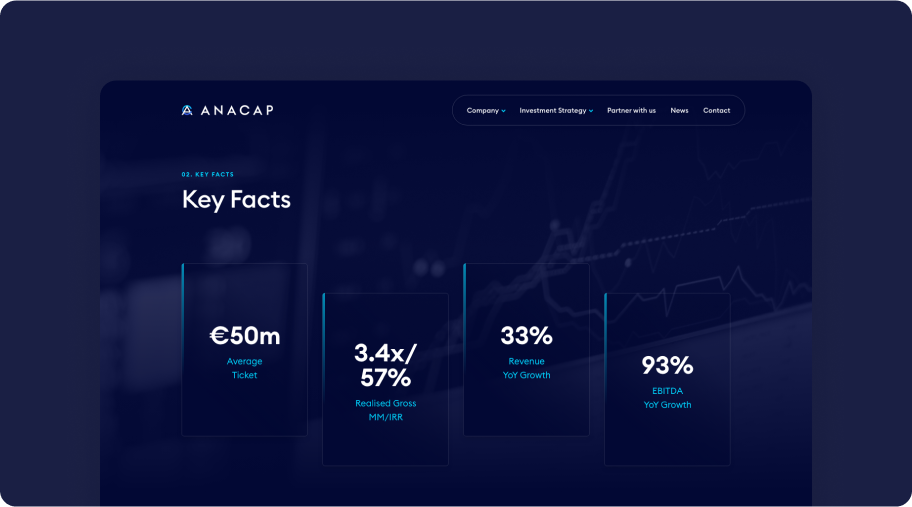
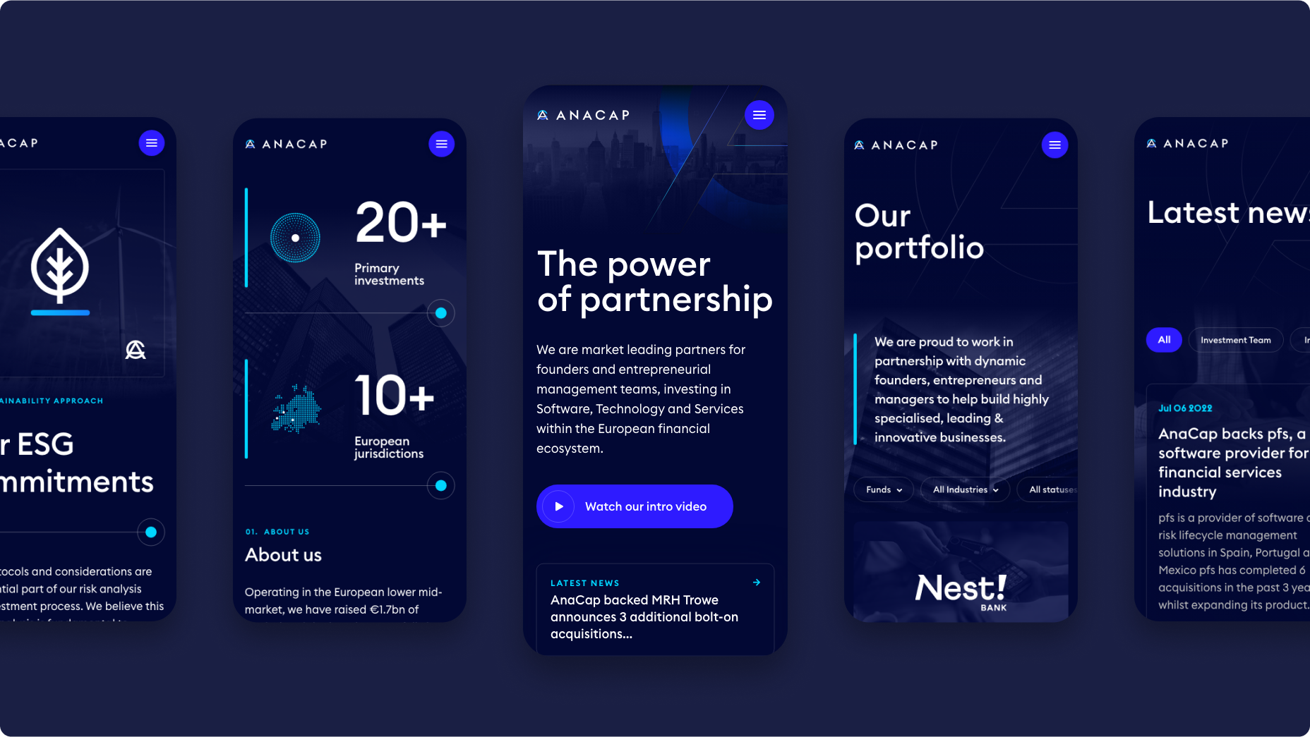
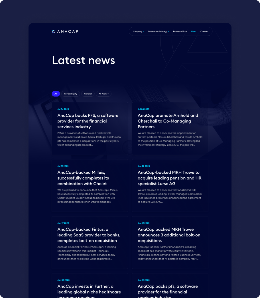
To ensure a seamless user experience that would generate leads and effectively convey the brand's story, I adopted a strategic UX approach focusing on streamlined navigation and digestible content. The website features a sleek, minimalistic design with a dark color scheme accented by vibrant blue gradients and futuristic graphic elements. A refined animation library was employed to ensure consistent and engaging component animations. Subtle imagery was incorporated to enhance the visual appeal of key sections.
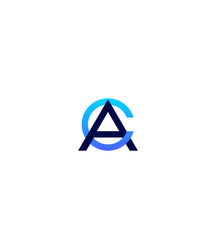
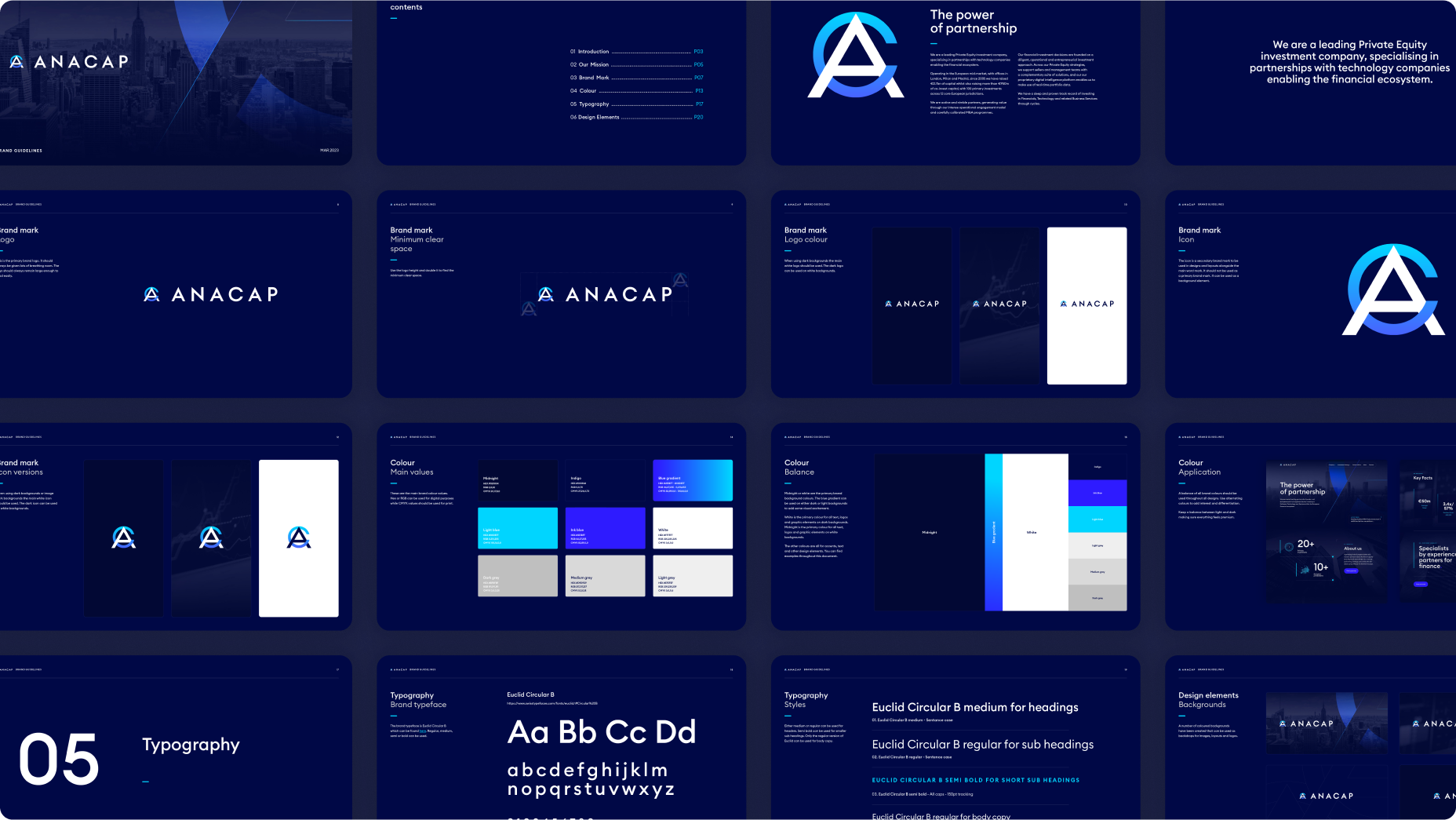
I introduced an A+C monogram inspired by AnaCap's previous identity, emphasising an evolutionary approach rather than a complete departure from their established brand. The brand identity was further reinforced through the use of a contemporary typeface that positioned AnaCap within the fintech landscape, enabling impactful, type-focused communications. Additionally, I created a set of sleek graphical icons for effective signposting across the website and presentations.

Thanks
for looking.
Email: jameshuse@googlemail.com
Linked in: linkedin.com/in/jhuse/
© James Huse 2023
